Tuesday, April 27, 2010

Boy and Their Guns

Photography is the newest type of art form to come about, creating it’s own medium of sorts. Some would assume that it takes the role of a 21st century replacement for classic paintings, but I wouldn’t say the two are necessarily mutually exclusive. Looking over T. Coke Whitworth’s photographs in the Ackland Art Museum’s “New Currents in Contemporary Art” exhibit, I came to see that photography is a more subjective and experience-based art form. When seeing Whitworth’s Untitled photograph of the young boys and their guns, I realized that the interpretation and analysis of these images depends on one’s cultural background and personal opinions.

Honestly, when assigned to go to the Ackland Art Museum and pick out a painting with some sort of underlying cultural meaning, I went straight for the screen prints about slavery and discrimination. Easy enough, right? The man disliked slavery. Okay, simple, straightforward. I’ll have this knocked out in no time. After leaving the museum though, the only piece of art that still had me thinking was Whitworth’s photo with the boys and their guns. I realized that I could write a hundred straight-laced blog posts about Jacob Lawrence’s exhibit on John Brown, but any Ted, Jim, or Nancy could see what those paintings were about. In order to fully activate my brain and write something semi-worth reading, I had to think outside the box. And outside this hypothetical box Whitworth’s photo was staring me in the face.

It is an interesting photograph to say the least. In the foreground, there are three young southern boys, probably around the age of ten-ish. They are standing in a field in front of a pickup truck, clouds and trees surrounding them in the background. Two of them are holding guns, one pointing it down and one just staring that the gun itself. The photo is perfectly in focus, every cloud and eyebrow hair visible. It is a straightforward photo, no blurriness or light shadows to over-interpret, just life. Dang it, how I wish you could see it, but it’s not posted on the Internet. Just stop reading this now and go to the Ackland and look. Go. And after you get back, you may resume reading my blog.

Initially, we each as individuals would have our own unique reaction to such a piece of work. Some people would just walk right on by, seeing nothing. Others would sympathetically stare into the emptiness of one of the boy’s eyes. And I’m sure there are those out there who would merely see something that makes them happy and proud: southern culture, male bonding, sons growing into men, etc. Being from the background I am from, I immediately took the second route: sadly staring at the art. Over-analyzations of the poor boy’s thought process: this culture he was forced into, what he should become. Who could miss such a sad image as this, right?

After getting back home and reading the artist’s statement about the work, my viewpoint completely changed. This man was just exploring culture, not trying to give some artsy-fartsy representation of the woes of southern culture and hunting. Apparently he had just moved to a new town and wanted a way to get closer to the locals. Wow. I was pretty off base with my interpretation, wasn’t I? This was the point when I realized how with any art, obviously there is an ever-present individual interpretation with each painting, but this is much stronger in photography. The clear, straightforward photo leaves no wiggle room when it comes to things like brushstrokes or color choice or body proportions. It’s all there, honest and clear-cut. The bulk of the creativity of the art comes with looking at the end product, not during the act of creating it. With photographs interpretation is the beauty, not the talent of the detail work or shading or type of paint used.

So, when forced to reckon with the idea of Whitworth’s social goals in this photograph, my gut reaction was my own personal social goals. This photograph is obviously about the absurdity of southern culture. At how even something as terrible as killing an animal is engrained in these adolescent boys. Using guns frequently is almost like a right of passage for them, becoming a man. I could even stretch it as far as to say that this photo holds a message about the violent American culture and little boys thinking “guns are cool” thanks to things like family hunting trips and video games.

But, alas, Emalyn is not always right about these things. Shocking, I know. A touch of research proves that Whitworth did not have such a social goal in mind. Odds are that he is on the opposite end of the spectrum when it comes to the sentiments evoked by this photo. This is culture. This is pride. This is a fabulous right-of-passage that luckily was documented in a lovely photograph. This is the shit you hang on the mantle right here.

This is why I love photographs. They seem so straightforward, yet a hundred different people could have a hundred different interpretations of the same photo. It’s all about background and personality. Is that the same case with something like the Mona Lisa? A picture is worth a thousand words, and odds are my chosen words versus Whitworth’s would be completely different.

Frida and Fertility


I’m going to go out on limb here (pun intended) and say that odds are the Frida in this painting has quite a stomachache. Nature is present in most of Kahlo’s work, from merely serving as a backdrop to being the central focus growing from her stomach. This article focuses on the argument that the symbolism of plants is Frida Kahlo’s work has to do with fertility. I think it goes beyond that. The natural aspects in Frida Kahlo’s work demonstrate fertility, but also her inability to go outdoors and her ever-present connection to the circle of life that nature presents.

The author of the blog post re-tells what Hayden Herrera said about Frida’s work. “In Roots…it is Frida who nourishes that land by giving birth to a vine. Curiously, given the painting’s title, the vine has no visible roots. It must, therefore, be rooted in Frida, but Frida, floating just above a barren landscape and painted in a much large scale, is rootless, as in a dream.” Due to the rather obvious plant growing out of Frida’s stomach, I can’t argue with the claim that Frida is, in a sense, giving birth to a vine. Contrarily, I would like to add to this claim as to explain to the reader why Frida would use nature to demonstrate such a topic as fertility.

Due to an accident at the beginning of her life, Frida was unable to have children. Some sources say she was barren, others say that she would miscarry or get an abortion. Regardless of the reason, fertility was a central aspect in many of her paintings because Frida painted about what she knew: her own personal problems. Another result of Frida’s accident was that she would often be bedridden and unable to go outdoors for days or weeks at a time. This explains why she would always incorporate nature into her work; it gave her a connection to an experience that was unattainable, much like having children.

Frida’s fascination with nature also ties back into her fascination with the circle of life, hence the fertility aspect of the quote by Herrera. She loved the interconnectedness of all beings, the unity between plants and animals, humans and the earth. This is why in her picture “Roots” she has plant stems growing out of her, which “expresses Kahlo’s desire for fertility and to be a part of the life cycle.”

Mexico is a fertile, beautiful, colorful land that is filled with flowers and plants. Frida had a connection to her homeland that was both literally and figuratively demonstrated in much of her work. This painting could also be a representation of that connection to Mexico specifically, the place where she is comfortable and feels at one with the earth, as shown in this painting.

People can surmise hundreds of interpretations about Frida Kahlo’s work, but one thing is for sure, she painted about what she knew best: her own personal feelings and problems. Nature was an ever-present motif that represented these varying sentiments felt by Kahlo herself.

An Interpretation of Frida Kahlo


External hearts, nails in your skin, and vines growing out of your stomach. Would these be images you would use to represent your personal life? Frida Kahlo, the famous 20th century Mexican painter, used exactly these things to describe hers. In the academic art history journal article “Life as Art/Art as Life: Dramatizing the Life and Work of Frida Kahlo,” the author believes that Kahlo’s intense emotions and overwhelming creative spirit were the driving force of her “genius” art. Her surrealist paintings fascinate the masses because of her not-so-evident thought processes. On the other hand, a different author from the New York Review of Books isn’t as complimentary. He recognizes Kahlo’s artistic talent in his article “The Nerve of Frida Kahlo,” but he is not afraid to acknowledge her obscurity, and he finds her constant physical and emotional pain somewhat depressing and gory. These art critics both recognize that Frida’s inspiration comes from a personal level, but they look at her work from different standpoints and therefore have different reactions to her paintings.

Most critics shower Kahlo’s art with undying praise, so it was difficult to find a critic who does not. Many professionals in the art community give bonus points for creativity and even more brownies points if you can make the viewer say “huh??” Only hints of such a reaction are provided in “The Nerve of Frida Kahlo”. Both authors acknowledge the fact that the inspiration of Kahlo’s paintings comes from a personal level; just one is more apt to report how this can become disturbing. Every artist wants their viewer to be filled with emotion, but was Frida really shooting for horror in her paintings? Obviously, art is all about opinions and the author of “The Nerve of Frida Kahlo”, like many viewers of Kahlo’s paintings, is mainly intrigued by her thought processes and the events that must have had to take place in order for such images to appear in her creative spectrum. He also hints at her self-obsession, seeing as how in almost every painting she is the center of attention. He criticizes the lack of “wide-ranging experience” in her paintings. Although each painting is unique with its masses of emotion and symbolism, most of them turn out to be depressing and angst-y.

The article entitled “Life as Art/Art as Life: Dramatizing the Life and Work of Frida Kahlo” looks at Kahlo’s work from a more academic standpoint. Obviously the writer is a fan of hers, but she genuinely researches the background of Frida and why she paints the way she paints. The author of this article very accurately states how “Frida’s viewpoint is expressionistically distorted; hence when she paints what she sees, she is intuitively a surrealist. These scenes effectively undercut the intellectuality and intentionality that characterize creativity in the arts.” When she isn’t being Frida Fan #1 (I bet that’s her screen name or something), she looks into the emotions of Kahlo and the life experiences incorporated into her paintings. Each picture is related to a life story, a sad challenge that Frida had to face in life.

When it comes to legitimacy and credibility, I would give the “Life as Art/Art as Life: Dramatizing the Life and Work of Frida Kahlo” a better grade. I believe this article, but the positivity eventually becomes mundane. “The Nerve of Frida Kahlo” is more entertaining to read, but it is mostly comprised of opinions and summaries, not hard evidence. Then again, that’s what art is all about, isn’t it? Opinions? Although her work is at times depressing, there is no denying the fact that Frida Kahlo used her personal life experiences and resulting emotions as inspiration for her work, an idea that was demonstrated in both articles.

Chaos of Life


On the day said of The Tilled Field there is chaos. Bright colors consume the canvas, capturing my eye. There is action throughout the daytime side. Animals are moving to and fro, crowding around the tree. Not only is there action in the foreground around the tree, but in the back. A woman attempts to move a tree, while smoke is coming from the house’s chimney. Chaos exists in the action, but also in the absurd characteristics of once real items: a tree with an ear, a half cow-half horse. Míro exhibits much of his past throughout his artwork, and in this work, the chaos of his life unfolds.

Born to parents in Barcelona, Spain, Míro began his life on an area of land resembling that of this farm; this farm may be seen in this piece of artwork. As he progressed forward in his life, Míro’s passion for art grew, and he realized that art was his true calling. While his parents had other ideas for his life, he put his feet in two doors – that of business as well as art. However, in the end, he prevailed, choosing art has his career. Likewise, this picture is presented in two contrasting sides: dark and light, with light overpowering dark – more light exists; it wins. Similarly, art won out. He did not choose business. Though business, or the dark of the painting, seems serene and picturesque, it is the art, or light, that Míro sought after.

As mentioned in a previous post, Míro wove his life into his artwork. However, he also incorporated styles of the time such as surrealism and cubism to aid in his portrayal of his chaotic life. His picture, integrates things he has come into contact with as well as past experiences. At the beginning of his artistic career, Míro moved to Paris. Ties with France are easily noted throughout this picture. The word “jour” is printed on the dayside, which is literally translated “day” in French. As well, the French flag is flown within the picture.

Throughout this of art, The Tilled Filled, chaos consumes the canvas. This chaos directly correlates with chaos that Míro experienced within his lifetime. Míro, living in Paris at the time, was prevented from traveling to his homeland of Spain because of civil war. Withheld from his own home, Míro’s life experienced uncertainty and many unforeseen events.

Within his piece, The Tilled Field, this uncertainty and chaos exist. There is confusion throughout. Míro incorporated the two movements he came into contact with within this painting as well: surrealism and cubism. He utilizes sharp edges and blocked objects to create unrealistic creatures, thus interweaving the two movements, generating bizarre animals. What are the animals? You can’t decide with assurance. There is a half cow, half horse - a cat with needles of a porcupine. A fish is on dry land, an ear coming out of a tree, a lizard and snail being “friends.” Míro does a superb job in creating a reality that is completely absurd, creating chaos from the unknown.

However, one thing within the picture remains normal, non-chaotic. This one thing is the house in the background. This house is not attributed any odd qualities. It is merely a normal residence. Míro dreamt of a gallery as well a nice house; it was a goal he strove for. Therefore, it follows that this is the one thing that remains standard; it is dream. It cannot be distorted by reality and the turmoil of everyday life.

Míro’s piece of art, The Tilled Field, is one of absolute disorder and confusion. He utilizes elements stemming from two specific movements, cubism and surrealism, in order to create this bedlam. This chaos reflects back on Míro’s personal life and how disorderly it was; the chaos of Míro’s life is mirrored through his artwork.

Colors and Symbols, a Key to John Brown's Ideals


When I first walked into the Ackland Art museum, I walked straight, then veering left into a gallery, I saw a sight that intrigued me. The walls were covered with paintings. What I saw hanging there seemed to be a picture storyboard of sort; a collage of paintings that progressed as I walked through the room. These pictures all included a man and at times, many other things. The pictures progressed to a final end; however, I could not interpret them; I did not understand what they meant. Then, also on the wall, I found an explanation: this sequence of paintings portrayed the legend of the famous abolitionist, John Brown. John Brown thought himself to be the savior of the slaves and acted upon this belief, planning means of escape for the slaves and staging riots against those who were pro-slavery. Walking around the gallery a second time, though this time with the aforementioned knowledge, I began to see symbolism within each painting, stemming from various different aspects of each of the pieces of art.

Number 13, one of the paintings in the series of The Legend of John Brown, is orderly and well planed. Your eye is drawn to several places within the artwork right off the bat. The black cross stands out, juxtaposed against a blue background. A map of the United States, spread across the table, exudes a bright red - the color of blood. Aside from the map and the blue background, the picture consists of bland colors. Jacob Lawrence utilizes certain colors to highlight specific aspects throughout his painting, Number 13. The colors also act as symbols and the orderly fashion contribute to the work’s meaning as Lawrence tries to portray the actions and thoughts of the famous abolitionist John Brown.

Looking at Number 13 in the Legend of John Brown, one’s eyes are immediately drawn to the blue triangle that envelops the top right side of the painting. This blue triangle radiates out from the lantern on the table; it is the light from the candle within. This blue triangle of light highlights a black cross that would have merely faded into the background without this blue light. The cross is located in the top right corner instead of the dead center; however, despite its location, it is still a focal point of the picture The light illuminating the cross comes from the table where John Brown is planning an escape route for the slaves. John Brown’s actions, finding a way out of captivity for the slaves, give light to why he is considered savior of the African Americans.
Another such image that catches one’s eye is the map of the United States of America, located in the bottom center of the painting. This map is consumed by red, outlined in a white, and then a blue. The red engulfs the map, symbolizing the bloodshed or guilt that drenched the entire United States due to the legality of slavery. This red did not merely cover the South of the pro-slavery states, but instead, it covered the entirety of the United States, showing that the fault lay upon the entire nation for allowing the practice of slavery to exist at all within the nation. This map consists of sharp angles; its outline line is harsh with no rounded curves. Like sharp angles, so was the government concerning the slavery. They left no leeway. Slaves were dealt with as if they were inhuman. Drawn on the United States map in black, various sketches and lines are seen. However, the only one that may be understood comes in the form of the Star of David in the top, left corner. In the past, Jews, often represented by the Star of David, experienced much persecution similar to that of the black slaves. They were discriminated against based on their religion, or in essence, who they were. Perhaps this Star of David is drawing a parallel from the past experiences of the Jews to the current situation of the slaves. The rest of the lines vary from thin, pencil marks to thick dots or triangles, merely marking the pathways of escape on the map for the slaves, denoting the final destinations on their escape routes.

Though I thought that the map of the United States, colored in by red represented a nation covered in the blood of the slaves, the guilt of the nation, I was in fact completely wrong. The artist who painted this work, Jacob Lawrence, recognized a key fact that I originally did not. John Brown set out with the idea that slavery was wrong as one any supporter of slavery. He launched many an attack on slavery advocates, spilling much blood. I understood that the red symbolized blood, but I thought it was the blood of the slaves. Instead, I now know this blood to be that of those he attacked on his plan – the blood shed as he forged his way to freeing the slaves.

The map, aforementioned, sits upon a tabletop located in the direct center of the painting. An older man with white hair (John Brown) sits at this table, pointing at the map. Seemingly deep in thought, both of his elbows rest upon the table as he leans over the map. He works by lantern light, the same light that brings focus to the black cross. John Brown’s posture and his working by candlelight give light to his dedication to his cause – the abolition of slavery. Alone he sits musing over his plans; alone he works through the night. The body of this man, clothed in black, blends into the black backdrop; however, his head and hands stand out, being painted in colors contrasting to black. Though as a person, John Brown may blend in with the rest of humanity, his hands and head stand out. Often times, hands represent one’s work and one’s head represents ideas or beliefs. Likewise, John Brown’s ideas of freedom and his personal plans that further obtaining this freedom for slaves are what make his name great; it is not merely him as a being that stands out.

On the right side of the artwork exists an empty chair spotlighted against the black background. A book resembling a Bible with red pages sits upon this chair. Contrasting this empty, serene chair with a Bible sitting on it is the left side of Jacob Lawrence’s artwork. This side of the artwork is light, with a tan background – no longer black. Regardless, four guns are the forefront of the left side of the painting. Three guns hang in a vertical manner while one gun is hung horizontally above the other three. This contrast from Bible to guns represents the vastness of John Brown’s character and his ideals. He longed for freedom of the slaves, which in essence, is a good thing. However, he went about starting “bloody battles with heavy losses.” The guns may represent the other side of this contrast. He began merely wanting to set things right, but this turned into wanting to conquer the South by force military force He wanted them to fail; he wanted to conquer the South.

There are many things to note within this one piece of art. The detail in color and placement of certain objects certainly add to the work. Looking at the piece of art without any background makes it hard to decipher; however, with a little bit of knowledge, the mystery of this painting begins to unfold. Though I was incorrect with some of the symbolism, the gist of the painting is clearly seen. The mere existence of slavery within the United States as directly/indirectly led to bloodshed. One man, the man pictured in the center, John Brown, will give light to the situation; he is, in essence, the savior. With beliefs all over the board, represented by the contrasting objects, he attempts to save the slaves. When looking at this picture closely, you can most assuredly see how Jacob Lawrence used symbolism to give a deeper look into the abolitionism of John Brown.

Complementing Views of Míro's Art

Artists place themselves in their artwork. Remember your first preschool drawing. My mom framed my first piece of art. I drew a picture of my best friend, Jessica, and I. No, the picture was not realistic, but it represented something deeper within me, an interpretation of my friendship with Jessica. I drew the inspiration from my experiences with her, and intertwined them within my drawing. The famous artist, Joan Míro composed his work similarly. One art historian, Mendelson, believes Míro’s work evolved over time as he learned new techniques and experienced different art forms. On the other hand, Palermo believes that Míro’s art was an actual response of Míro’s to the artistic movement of Cubism. Though both art critics have concrete beliefs concerning Míro’s work, their ideas may actually work together, complementing one another, offering a deeper insight into Joan Míro’s artwork.

Mendelson suggests that Míro’s work evolved over time. By incorporating clippings from the media, Míro intertwines society throughout his artwork and because society changes and varies from place to place, his art did as well. Míro began his work in a simple manner. He simply took clipping from newspapers or magazines, pasting them to paper. Looking at these clippings, he would connect them with shapes or lines. However, in time, this began to transform into a more current art style. Instead of pictures linked together with lines, he used the clippings to inspire other elements within each art piece. Beginning with a clipping from a magazine or newspaper, these clippings “would lead him to draw a form, which in turn would compel him to paste another image, until the moment when the picture attained the most intense poetic expression without the discipline of the plastic arts losing its privilege.” His works were considered “violent and playful, erotic and innocent, calculated and full of chance.” After a visit to Italy, he then began incorporating various mediums within his artistic collages such as wire, photographs, felt, and metal. He pierced his canvas with items creating a 3-d effect; however, these changes in his art were not popular with his viewers or critics. The last step on the evolution of his art was noted as postcard art where a piece of artwork would revolve around a picture, originating from a postcard, pasted onto his canvas. In viewing Míro’s art, it can be easily seen that his work and style progressed over time as new possibilities came about for his art.

Palermo’s claims that Míro’s art is representative of Míro’s experience with the Cubism movement – that the “pictorial space becomes a surface in which the activity of a surrogate offers a metaphor for the painter's bodily entry into the surface of the painting.” Cubism, birthed by Picasso and Braque, is an art style that incorporates geometric shapes. Instead of having art mirror reality, Cubism instead interprets reality using by creating 3-D images on a 2-D canvas. It is much like it sounds; Cubism is merely presenting something by drawing it in cubes. Míro did in fact integrate Cubism into his art. It can be noted in many of his paintings. Palermo believes that each brush stoke, each line drawn is a representation of Míro’s personality.
Mendelson and Palermo do not present opposing claims concerning Míro’s artwork. Contrary, their claims may actually go hand in hand. As Míro experienced the Cubism movement, his artwork was likely to evolve with this movement. His original art did not seem to incorporate Cubism; however, at a later point it did. This in itself offers evidence to the evolution of his work. Palermo denotes his art as a personal response to Cubism, which is valid. His reaction towards Cubism was indeed to portray this new art form within his work.

As Mendelson suggested, Joan Míro exemplified the way in which art can progress over time. Not only did his work alter as he visited different countries and experienced different art movements, but he intertwined all he learned within his artwork. Palermo also suggested that his artwork portrayed his personal response to the Cubism movement. These two ideas work together, showing not only how his skill and ideas changed over time, but how he incorporated his personal change into his artwork.

Monday, April 26, 2010

Jacob Lawrence's Message Lies A-Mouldering in the Frame

In pictures, John Brown is a severe man who looks like he should be feared. In this painting, he is the one who looks afraid. He stands forlornly, hands outstretched, and wide eyed. This fourteenth image in Jacob Lawrence’s series, The Legend of John Brown, is different from the rest because Brown appears both alone and unarmed. These traits separate it from all the others and allow Lawrence to get his message across. According to Lawrence, John Brown was a hero, a champion of black people, and he should be honored as such. The artist’s crude artwork and symbolism fail to get his point across though, and what is left is the vigilante we all know.

High school history courses teach students that John Brown was a maniacal vigilante who committed acts of violence in the name of abolition. He believed he was sent by God himself to free the slaves. His 1859 attempted occupation of the federal arsenal at Harper’s Ferry is seldom missing from the chronology of events leading up to the Civil War. Jacob Lawrence originally painted The Legend of John Brown in 1941; the series tells the story of his life through twenty-two captioned images. The caption for number fourteen is: “John Brown collected money from sympathizers and friends to carry out his plans.” The caption and image say two different things though.

Brown stands before a rickety looking table that bears two silver and two copper coins. He is alone in what must be a church, for the Virgin Mary resides on the wall to his right and a crucified Jesus hangs opposite her. Lawrence’s attempt at perspective makes it seem like the church extends fairly far back, and the paintings to either side must be enormous to fill up their entire walls. Such a large space could surely house all of the people sympathetic to his cause, yet Brown is the solitary figure in the print. If he is a hero fighting for a just cause, he should be accompanied by friends and supporters, people sympathetic to the plight of the slaves like him. His company is absent though. Sure, at least four people have come by and chipped in, but that is not enough to capture an arsenal, much less abolish slavery. A painting that should show the makings of a great triumph for a man supported by many instead shows a lonely man on the brink of failure. For those who know the history, it appears that all of John Brown’s followers realized that they could not match his fervor and that they were saner than he. They understood that such small resistance would make little difference and chose not to follow Brown past the point of no return.

Knowing John Brown, closer examination reveals that he is not alone at all. In his mind, Brown had no greater sympathizers than Mary and Jesus, except for God himself. He stands between two of the most powerful symbols in all of Christianity, the Virgin and the Crucifix. To a spiritual person, he needs no other support. However, the symbolism is subverted by the quality of the art. The figures flanking Brown appear to look down as if they are judging him. Their gaze puts him on trial for the crimes he is going to commit. This interpretation would not be possible if Brown was more realistically portrayed, but he looks like he is cowering in fear. He shows the whites of his eyes and holds his hands as if to ask why he deserves such accusation. Lawrence has drawn him hunched over like a dog with its tail tucked, afraid of being beaten. Brown is not illustrated with the posture or conviction of a hero, and the heavenly figures look more like they want to send him to Hell than send him to abolish slavery.

Lawrence’s use of color does little to support his message. The church itself is a dull mix of grays. Mary is clad in blues and red, which are pure colors befitting her character. Jesus is covered only by a red cloth. Both instances of red can be seen as testament to the blood to be shed by the man in black standing in the middle. Perhaps Brown is meant to be wearing the color of the people he fights for, but the archetypical role of a black knight has always been a villain. That is the tone that resonates from the image of a man in black, cowering beneath the son of God and his mother. The color that speaks more volume than any other in the painting though is the deep blue seen out the door behind Brown. Lawrence uses a near identical shade of blue in the final image in this series. Its presence in number fourteen only serves to foreshadow the end, the inevitable hanging of a vigilante brought to justice, and his ultimate failure to complete his mission. With that blue, Lawrence foretells the death of his hero.

It should not be a difficult task for a black American to portray John Brown as a hero. He was one of the most outspoken abolitionists of the antebellum era. However, Lawrence has failed to adequately portray Brown in such a light, and he was doomed to begin with. Cubist artwork is highly open to interpretation, yet it is poorly suited for the depth of symbolism Lawrence hoped to achieve. It was his intention to show John Brown, an incredibly pious man, collecting offerings from other such people within the house of God to fund his quest to end slavery. After this scene is converted into a cubist work, we are left with a mockery of the righteous protagonist and the holy ground he stands upon. Brown was a physically imposing man with a fearsome gaze that put fear in the heart of pro-slavery Americans.

Pictured: The Personification of Pro-Slavery Fear

Lawrence presents us with a weak, old man, unarmed and unaccompanied on his road to failure. His attempt to present the man as more than a vigilante pales in comparison to Robert Hayden’s, whose poem glorifying Brown’s efforts features on the wall next to the series. Hayden’s work proves that the message was ready to be sent, but only through the proper medium with the proper style. Lawrence simply made the wrong choice.

Jacob Lawrence’s fourteenth image in The Legend of John Brown is the point that his message begins to unravel. Cubism is a poor interpreter for sympathizers of John Brown. The proud, righteous man Lawrence wished to show his audience looks like a hobbled, old beggar in the finished work. As such, we are unable to suspend our knowledge of Brown’s true nature, that of the man who took justice into his own hands, who thought he was chosen by God. Actually, Brown was rather prophetic in the end. His last words haunt our nation’s history: “I, John Brown, am now quite certain that the crimes of this guilty land can never be purged away but with blood.” It’s certainly not the mark of a hero to condemn his country to war though.

Man vs. Universe, Opinion vs. Opinion


The Monk by the Sea
shows German Romanticist artist Caspar David Friedrich standing by the sea, battling with the vastness of the universe. A solitary figure stands upon a rocky shore, concentrating deeply upon the scene before him. He appears, and indeed feels, small in comparison to the towering horizon, powerful, dark clouds threatening to blot out the blue sky just as despair threatens to consume his soul. It takes much contemplation to pull meaning from Friedrich's paintings, and not everyone will come to the same conclusion. The beauty of Romanticist art is that it holds a different message for everyone.

The painting itself is dominated by the sky. The lowest third consists of sea and land, but the rest is above the horizon. Dark gray clouds touch the sea and fade into pale blue sky at the top of the image. Whether these clouds are a coming storm or just a thick fog is difficult to decide. Friedrich gives little indication of the time of day. There is no trace of the sun, but the fact that it is not seen high in the sky suggests that it is either dawn or dusk and must be obscured, rising or setting behind the clouds. The titular monk may be Friedrich himself. Close examination reveals what looks like the artist's trademark flowing, golden beard. It is just as easy to see a man resting his chin on one hand, but Friedrich did numerous self portraits, habitually placing himself in his art. The monk is such a small element of the overall work though; it seems that the action in the painting takes place in the sky above where Friedrich has painted a mental canvas of his emotions. If the scene over the water is any indication of what was going on in his head, then it is clear the artist is verging on despair. Friedrich was prone to bouts of depression, which showed up in trends in his work, so this conclusion comes easily.

Beat Wyss sees a completely different painting in his article "The Whispering Zeitgeist." To him, Friedrich's portrayal as a monk is in keeping with the German Romanticist movement. He does not consider the artist depressed in the least, and indeed says he is at one of the most self-secure moments of his career. In studying his many self portraits, Wyss has determined that Friedrich considered himself a modern human being for which "the world is no longer mirrored in his mind." Surrounded by nothingness, The Monk by the Sea is a testament to the endless struggle between the individual and the universe, singularity and infinity. Wyss says Friedrich has gone further though. He looks out at the sea with his precise view of the world and challenges his audience to hold the same view. If they are unable to, then they should walk away because they are not worthy of his presence. Wyss does not believe that the famous Romanticist had a message for everyone, but only for his kindred spirit. This interpretation paints both Wyss and Friedrich in the harsh light of egotism.

Two people can look at The Monk by the Sea and see two different works of art. Where I have seen a man transfixed by despair, Beat Wyss sees a battle between one man and the rest of existence. Others might see dark times receding, or just a lone man watching the stormy sea. Before coming to his exclusive conclusion, Wyss says, "The core meaning of Friedrich's paintings lies in the viewer's own interpretation, and there is nothing in them that does not already exist in the viewer's heart and mind." While Wyss and I may disagree on what the painting means, we can agree that it means something different to every person who sees it.

Wandering Between Two Mists

The view of The Wanderer Above the Sea of Fog offers a glimpse at awe-inspiring infinity and, some even say, God himself. The mists that cover all but tell-tale features of the ground below and beyond create a landscape so poignant as to be considered divine. It is this ability of Caspar David Friedrich to add such depth to his landscapes that leads Simon Morley to say his art is imbued with the power of religion. However, Stefan Lüddemann reports that Friedrich might have different ideas in mind for his abilities. A curator of a museum in Essen, Germany says that he actually filled his paintings with principles of the secret society he belonged to, the Freemasons. These contrasting opinions both show that Friedrich's art was more modern and advanced than the average romanticist.

The turn of the nineteenth century saw a general movement away from the intense religious values society had held in the past. Many romantic artists like Friedrich noticed that fewer people were looking for religion within churches, so they sought to help people find it within art instead. Morley says in his article "To Infinity and Beyond," that Friedrich was more of a transitional figure, "with one foot in the world of traditional Christian faith and the other in the far less charted seas of what might be called modern 'religiosity', or the unhoused religious impulse." He claims that Friedrich was less interested in replacing religion than he was with creating art that served as a religious experience to his viewers. Morley compares Friedrich to William Blake, a romanticist that had similar motivations, albeit for a different artistic medium. Returning to The Wanderer, Morley lauds it as a piece of art that embodies the spirit of transcendence, the quest for heights yet unseen by others. For Friedrich and his wanderer, to reach these heights must have meant to reach the presence of God himself.

The Wanderer is probably one of the least blatantly religious works in Friedrich's repertoire, yet Hubertus Gassner thinks the looks of much of Freidrich's art are deceiving. Stefan Lüddemann of the Atlantic Times writes about Gassner's 2006 Friedrich exhibition and the theory it puts forth. According to Lüddemann, "[Gassner] believes the artist incorporated the Freemasons’ worldview into his paintings as a kind of secret message." He disagrees with most art historians who paint Friedrich as the quintessential, hopeless romantic of Germany, and instead posits that all of his art was precisely composed to embody his hidden ideals. The curator goes even beyond the idea of hidden Freemason principles, and boldly arranges his exhibition in a way that shows Friedrich as the forerunner to modern media art. Gassner says that Friedrich had tendencies to couple pieces of art with specific musical works, and that he would paint entire series on certain subjects. It seems the artist transcended romanticism altogether.

Lüddemann's journalism provides a concise summary of Gassner's argument, but it provides few examples of art that support it. Morley's article provides more evidence of in depth research and gives more examples that support his thesis. That plus the fact that Gassner's suspicions of Friedrich's involvement with the Freemasons is fairly new make it seem as though Morley is more likely to be correct. However, both men have shown that Friedrich was ahead of his time on a number of things. Morley describes how he was aware of society's changing values and that people would need to find God somewhere other than church. Gassner's knowledge of the trends in Friedrich's art show that he was more organized and thoughtful than the average romantic artist. So, the sum of these opposing views is that Caspar David Friedrich's ability as an artist transcends his motivations for creating his art. Those reasons will remain up to each individual wanderer's interpretation, obscured by the fog.

Speaking Through the Lens

(This is a sample photograph from the Whitworth collection. This is not the photograph mentioned)

Upon first glance, the photograph collection by T. Coke Whitworth in the Ackland Art Museum seems almost comical. The collection includes a photo of a deer in the family living room, as well as a photo of three boys practicing their gun skills. Like the artist I spent part of my childhood in the “backwoods” of North Carolina. My dad raised hogs, and birthdays meant ‘pig pickins’. My little cousin got his first bb gun when he was eight, and by age ten his favorite sport was ‘huntin’. Perhaps this is what first attracted me to the collection. I could relate to the people and the setting of the photographs. To me, it was sort of ‘a day in the life’. However, one picture stuck out from the rest. It was a photograph of the woods, almost identical to the woods I played in as a child. The trees are not dense, they are farther apart. There are a lot of greens and browns, and even white, which means it’s probably late winter or early spring. The woods’ floor is littered with debris. There are tires, a broken recliner, animal carcasses, and a plethora of other trash. On the foremost tree there is a picture of the back of a very large, naked woman. Again, this photo has that comical aspect. But when I started to actually study the picture more, I realized that the artist was saying something through this picture. Through this photograph, artist T. Coke Whitworth is attempting to convey the careless attitude society has adopted towards the environment.

Initially, the message the artist is trying to convey is somewhat subtle. There are no environmental aspects shown in the painting. When first looking at the picture, you may think the artist is just trying to be funny. It is entirely possible that he placed the trash there for artistic purposes. However, I do not believe this is the case. According to the artist, his motive was to capture true life in his hometown of Zionville, North Carolina. By doing this he is revealing truths about society that are more pertinent to me than any picture taken in a big city like New York or Los Angeles. You would expect to see abominations to nature in a larger city, but not in a small southern town. The artist uses various tactics to make his message stand out in the photo.

Essentially, the fact that the debris are in the foreground makes them the focal point. This helps to make the message clearer. The audience’s gaze immediately follows the pattern of the trash. The rubber tires, the broken recliner; and then you start to notice smaller details like the dead animal carcasses and the fur. Finally your gaze centers on the picture within the picture. The photo of the large naked woman hanging on the tree is appalling and somewhat disgusting. Then you start to become disgusted by the entire photo. The trash and animal carcasses are seen in an even more negative light. In my opinion, the author uses this method to engage the audience’s view and attract them to the real message of the photo. He is depicting a sort of ‘throw away’ society. Obviously, whoever dumped the trash there had no concerns about the consequences it would have on the environment. Obviously the trash is unable to decompost, and therefore is polluting the forest floor. Besides this, the audience also sees how the trash affects a once beautiful woods scene. The background of the photo is the woods without any trash. This half of the photo is picturesque. By capturing both sides the artist allows the audience to see the ugliness of the littered forest floor. These methods all help to convey the artist’s message that society is unconcerned about environmental issues. Our society has become a selfish one. They throw their trash away wherever they want to, without considering mother nature.

Now, you may be thinking my view is a bit far-fetched. It may be. The artist himself in his statement says that he is interested in capturing heritage, both emotional and physical. However, he also states that he is attracted to looking around his hometown and seeing the socio-economic and environmental evidence of what has been passed down. The artist’s statement only reinforces my opinion of the digital print. His photograph of the trashed forest is a warning. If society continues in this way, what will we be passing down to future generations? Surely they are entitled to see the woods in the picturesque way nature intended them to be, rather than the trashed version today’s society is creating.

Ultimately, I enjoyed viewing T. Coke Whitworth’s collection in the Ackland Art Museum. By examining these photos, I forced myself to search for the message he was trying to convey. If I had only glanced at these photos I would never have been able to see that he was speaking about society’s carelessness through his art. The photograph of the littered forest floor is especially pertinent to this subject. By photographing this, the artist demonstrates that what society is passing on to future generations is a polluted world. Through his art I believe Whitworth is warning society, and conveying the foolishness of this. The most important part of this piece is the photo within the photo. The artist uses the hideousness of it to parallel the hideousness of the trashed woods. Society should take this message to heart, and prepare a beautiful world to be enjoyed by generations to come. You should also learn from my experience. When dealing with art, you cannot always see what the artist is saying with just one glance. Sometimes you have to dig deeper to see the true meaning.

Do You See What I See?


Salvador Dali's "The Metamorphosis of Narcissus" is a surrealist painting inspired by Ovid's rendition of the Narcissus myth in "The Metamorphoses". Using vivid colors and representations, this painting contrasts two images of Narcissus before and after his transformation. The first image on the left represents Narcissus' vanity and selfishness. The second image (on the right) represents Narcissus after transforming into a flower. This painting is fairly self-explanatory. However, there are certain aspects that you probably wouldn’t catch at first glance. One author, Milly Heyd, wrote her opinions of this piece in the article “Dali’s Metamorphosis of Narcissus Reconsidered”.

For the most part I tend to agree with her associations of Dali’s symbols and meanings. For instance, she believes that the colors used in the painting are significant to each side. The left side features warmer colors, like yellow and orange, while the right side is painted in whites and blues. She associates the warmer colors with blood, and the whites and blues represent innocence. I agree with her perspective. The warmer colors represent Narcissus before his transformation when his vanity consumed him. His transformation to a flower is a metamorphosis to innocence. Heyd also believes that the geometrical shape of the “head” is significant in that it represents an egg. The “egg” on the left is cracked and withered, representing death. The “egg” on the right is renewed, and a flower is growing out of it. According to Heyd, Dali uses the “egg” head to represent a new beginning, and the cycle of metamorphosis. Again I agree with her in that the egg symbolizes a new beginning. However, when I look at the picture I don’t see a body with an “egg” head. If you look closely you can see the “body” actually forms the shape of a hand. Each hand is holding its respective egg. In my opinion, Dali painted hands to emphasize that each person controls his own destiny. Narcissus’ transformation was due to his immense vanity. In the same way, each person is responsible for the transformations they undergo throughout their own life.

Ultimately, this is just my opinion of the painting. Of course, the author of the article is much more researched and knowledgeable about the art field. I do agree with her interpretation of the meaning of colors and the symbol of the egg. However, our opinions differ in that I believe the “body” is actually a hand. Don’t let our opinions sway you! Even though you also may be an art newbie, take a look at the painting and interpret it for yourself. That’s the great thing about art. There never is just one right answer!

Dali Debate


Have you always been interested in the art world, but never really known where to start? If so then you're not alone! As I was perusing the internet for an artist to write about, I realized that I didn't know about any artists except the basics. (You know, DaVinci, Michaelangelo, etc.) Soon, however, I came across an artist whose paintings I'd seen before, but I'd never known his name. His most famous piece of work is his painting "The Persistence of Memory." You've probably seen this before without realizing who the artist is (like me!). The image is one of melting clocks on a barren landscape. Sound familiar? The artist's name is Salvador Dali. Salvador Dali was a Spanish painter, sculptor, graphic artist, and designer. Both Dali’s personal life and work stirred up the art world during his time. Even today, he is still considered one of the 20th century’s most controversial artists.For example, one debate about Dali's work is what his focus, or motivation, was. In this debate one author argues that Dali's interest lay in the unconscious, while another argues that culture was his forte.

During the early 20th century, surrealism was a popular avant-garde movement. Artists working in the style of surrealism “sought to express ‘the real processes of thought’”. Surrealists liked to work with the irrationality of the unconscious, or dream world, and they acknowledged diverse political movements of the time like communism, fascism, and liberalism. These artists were inspired by the writings of Sigmund Freud, which explains their obsession with the unconscious, the illogical, and fantasy. Some art critics think that by working in the style of surrealism, Dali relied on imagery rather than form. One critic, Robert Turner, wrote a review of Dali’s work in the article, “Power to the Imagination”. He believed that Dali created work in this surrealist style to help people achieve an imaginative state, better than everyday reality. This author also wrote that surrealists like Dali, drew some inspiration for imaginative pieces from a variety of historical sources. So if you’re a history buff, you may like Dali’s work “The Metamorphosis of Narcissus”, which depicts a scene from the famous Greek and Roman poet Ovid’s “Metamorphoses”. Ultimately, the author of this article believes that Dali’s primary focus in his paintings and sculptures was “liberating the mind”.

Other art critics, however, differ from this opinion of Dali’s focus. One such author, Mark Van Proyen wrote his views in the article, “On Point”. This author agreed that Dali was a surrealist, but in his opinion, Dali focused on culture rather than reality or the unconscious. According to him, Dali tried to portray that popular culture was the “only real living culture”. This was because his works had an enhanced “illustrative and sentimental character”, meaning his art was full of vivid color and emotion. Other artists would later follow his dip into the “pop art” pool, such as the famous Andy Warhol. By focusing on popular culture, this author believed that Dali was ‘sticking it to the art world’. He was exposing the truth about what the art world was becoming, entertainment based solely on investment. No wonder art snobs didn’t like him much, right? After all, he was turning their prestigious art world upside down. This author believed that Dali’s eccentric focus on culture was shockingly surreal for his time, as seen by the art world’s opinion of him at the time.

Although both authors believe Dali was ahead of the game, they differ in their opinions on the focus of his work. Personally, I agree with the first author. In my opinion, Salvador Dali was an artistic genius who had the most fun working with reality, and thereby disfiguring it. His paintings invoke images that you would find in your wildest dreams. I am definitely not an art critic, but I feel that Dali’s works portray that he was more interested in abstract concepts like time, rather than culture. No matter his focus, his works definitely did revolutionize the contemporary art world, and hopefully, he has now sparked your interest in art!

Thursday, April 22, 2010

A Black and Blue Bomb


At first a blurry amalgamation of dark shapes, but no! A foreground and a background quickly materialize before me. In the background: horizontal lines, if you can call them lines. More appropriately they may be described as fuzzy shifts from dark blues to grim grays, or rather, when studied closer, an intense vertical zigzagging like the image on a hyper-active heart monitor. The highest stripe is the lightest in color, perhaps suggesting a sky. Below it lays a much darker stripe with a heavily pointed top, perhaps suggesting a shadowy tree line. Below that, is a flat, lighter stripe that my brain morphs into a grassy (or icy) field.


But this, this is the background. The foreground is what draws my eye. A massive, vertical…well, something swells from the lowest field-like stripe and continues upward without border off the top of the canvas. The conspicuous something has a nearly black base, darker than any other color in the image, and a nearly white top, lighter than any other color in the image. I didn’t know what to make of it, so I glanced at the title for a clue. “Japanese Landscape,” it was called. A moment later my interpretation clicked. This object at the center, so I perceived, was an exploding atom bomb! The artist, Felrath Hines, would have been a young adult at the time of the US bombings of Hiroshima and Nagasaki. An African American artist deeply rooted in the Civil Rights movement later in his life, I understood this bleak portrayal of what appeared to be an exploding atom bomb as a meditation on the feeling of hopelessness in the face of oppression, of a question of purpose in the face of something so powerful, and of a deep despair at the bigotry and bullying so ingrained in the history of our world.


With the awkwardness-insensitive security guard’s eyes constantly keeping an eye on me, I studied Hines’ image in Chapel Hill’s Ackland Art Museum for nearly half an hour. As I contemplated the piece before me, I moved from one side of the nearly seven foot canvas to the other. I moved from within inches to the other side of the room yards and yards away. I squinted my eyes. I turned my head sideways. I even lay on the nearest bench and looked at it upside down. No matter what angle I view it from, the most pervasive element is a deficit of color. There are no pinks, yellows, or oranges, only blacks, blues and grays. The colors one might see on a rainy day or during an icy winter. While making use of very few colors of the rainbow, however, no two shades are exactly alike—(glance) yup; the security guard is still watching me. The lack of detail and the blurredness of borders delineate a general lack of definition. But the focus is at center-stage, where the giant blob blocks out everything behind it. The contrasting halves within the blob have borders different from the rest of the painting. Instead of the equivalent of paint-brush “chicken-scratch” the distinctions here are much more crisp and blunt in comparison. Finally, the top of the blob is unseen beyond the canvas suggesting that the figure doesn’t end there. The longer I studied, the more these visual clues began to coalesce and I began to delve into a more interpretive level of thinking.


First off, the dreary palette of colors generated a bleak, almost depressing sentiment. This, coupled with the all around indefinite nature of the painting, was unsettling and presented me with a lack of satisfaction, as I didn’t know what to make of it. Nonetheless, the sense of space and contrasting colors (light and dark) lends itself to an outdoor setting. With this schematic framework in mind, the artist’s intentions become clearer. As the title suggests, the image is of a landscape (this is very difficult to know for sure based on observation alone). What then, is the giant shape in the center? Why is the landscape a Japanese landscape? The fact that the object continues upward out of the frame gives me the impression that the object is rising. The object is also hourglass-shaped, and is divided into two highly contrasting colors. Could these not be fire and smoke? Is an hourglass-cloud too far off from a mushroom-cloud? I took these leaps of logic and found that yes, for the most part, this interpretation held firm when super-imposed onto the objective collection of observations. Finally, as the bombings in Japan are perhaps the darkest days in its history, I thus concluded the object in the center to be an atom bomb.


But why an atom bomb, what social commentary or aesthetic goal is Hines attempting to reach? The most obvious answer is that he is attempting to engender a sense of despair in his viewers. An atom bomb is one of the most destructive forces on the planet, and watching one erupt on a peoples’ homeland will never be a pleasant experience for a sane person with a sympathetic heart. A force so awesome is hard to reckon with, and once it is detonated, annihilation is a virtual certainty. Thus with despair comes hopelessness. What can one do against something so callous and uncompromising? This leads one to question whether peace is attainable, whether your life and your cause were for naught. Finally, once you question the sound of your voice, of your right to be heard and your ability to speak up instead of blown up, you become pessimistic about the human race, about our violent history and our ever-oppressive manipulations. You wonder if it will ever end.


As history plays out, and mankind struggles with conflict after conflict, Hines is recognizing the internal pessimism a good-hearted man feels in times of hardship, the part that wants to break down and cry because prevailing seems futile. By doing this he is illustrating the very face of his enemy, so that he can look it in the face, and deny its influence. He is exorcising his demons, giving them a face so that he can distinguish them from himself. He is speaking to his viewers, not only through his painting but also by his actions in life. Despite the obstacles he faced, Mr. Hines was a resilient member of the Civil Rights Movement, and progress has been made. The bomb may be scary, but if your cause is noble, you will never be for naught.


“I never could figure out exactly what that was supposed to be,” a voice from behind me said. It was the security guard, breaking our uncomfortable half-hour silence.

I smiled, slightly amused. “Neither can I,” I said, but I had an idea.

To Please or to Succeed


While I can indulge in the latest quirky selection at the Sundance Film Festival as well anyone, I am also quite susceptible to enjoying the latest swashbuckling blockbuster from Hollywood, too. Rotten Tomatoes can dissect the political symbolism and daring originality of a film all they want, but when it comes to flat out entertainment, I say Indiana Jones beats Last Tango in Paris every time. If critiques of such mediums were democratic, most reviewers would be out of the job. This snobbish circle of condemning connoisseurs exists in the art world as well. Twentieth century artist Jack Vettriano, for example, has been labeled “unimaginative” and “sexually rampant” by these predatory critics. But accusation is a luxury of those on the sidelines, and if pleasing the masses brings Jack Vettriano happiness, I say his soul has not been sold.


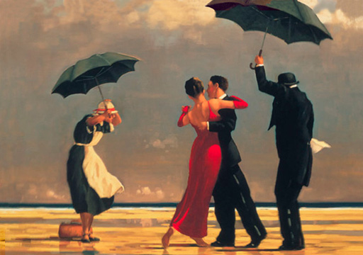
A man with a knack for painting, Vettriano put his skills to work on the subject that interested him most: women. Vettriano once told his house journal, Scotland on Sunday, that the art world "doesn't like rampant heterosexual behavior. Somehow, they think that it is a bit tawdry, not what real art should be." With paintings ranging from a couple dancing on the beach to a woman in scant clothing engaged in a steamy act of foreplay, the elite of the artistic community stuck up their noses and considered him gutter-brained rather than gifted. The rest of society, however, took to his work almost immediately, propelling him to a popularity rarely rivaled in the realm of art. His painting The Singing Butler became face of the most distributed postcard in all of Europe once it was published. To his critics’ dismay, the fantasy of dancing on the sands while being serenaded by a butler captivated the imaginations of millions more effectively than Monet’s lily pads ever would.


In her article “The People’s Choice,” Jacqueline Harrett’s agrees with the critics who bash Vettriano work, claiming that “popular art is not necessarily good art.” She also points out that none of Vettriano’s paintings hang in national galleries and describes his work as lacking perspective, depth and texture, and having a uniformity of style that borders on monotonous. Furthermore, she criticizes his lack of originality by supporting the notion that he allegedly mixed and matched details from his favorite photographs to create his paintings. Ultimately, she takes the thumbs-down perspective and condemns Vettriano as charlatan, proclaiming his work to be amateurish and lacking in any true artistic style or direction.


But take Vettriano’s most popular piece, The Singing Butler. Does it not possess the same graceful angularity, the same play of light and shadow as one of Pierre-Auguste Renoir’s famous dancing couples? Better yet, Mr. Vettriano’s piece suggests a heightened sense of occasion, an emotional endearment unmatched by the classic French painter Renoir. The eye is drawn to the woman in the red dress, her face turned away from the viewer, leading one to wonder what beauty the painter has chosen to hide. The subtle coexistence of evening sunlight and grayish-purple rainclouds above can also be seen reflected in the puddles in the sand and the in ocean surf in the distance. The flapping of the Maid’s dress and the slant of the umbrellas create a sense of movement, of wind that cannot interrupt the intimacy of the dancing couple. Does this sound lowly? Does this sound vulgar? I think not.


With these thoughts in mind, I refute the uppity claims of the so-called artistic elite, and personally recognize Jack Vettriano as a talented painter capable of capturing the spirits of millions. His use of color and brush techniques may not be revolutionary, but art doesn’t necessarily have to be revolutionary to be done well. I say, Mr. Vettriano, you have done well.

A Picture is Worth How Many Words?


A picture is worth a thousand words, so the saying goes. The tricky part is figuring out exactly what those words are. With all the Monets and Van Goes long deceased, it is the labor of modern day artistic scholars to speculate the brainwork behind the brushstrokes. The late French Neo-Impressionist painter Paul Signac’s (November 11, 1863 – August 15, 1935) works are of this interpretive variety. Friends with a few famous anarchists of his day, it has been speculated that such sentiments can be seen in his paintings. It is believed by some that the stark contrast between his two favorite subjects—seemingly upper-class people in seemingly upper-class households and peaceful scenes of green, undisturbed nature—represent the two steps in his plan: first, revolt against the corrupt and incompetent ruling class in France, and two, begin fresh in the paradisiacal retreat of the Mediterranean coast.


In Robyn Roslak’s article entitled “Artisans, Consumers and Corporeality in Signac’s Parisian Interiors,” he suggests that Signac’s paintings criticize the callous, materialistic lifestyle of the ruling Bourgeois class in France. Roslak points out that Signac’s paintings Dining Room and A Parisian Study both feature “the affluent Parisians who bought and fetishized consumer products of every sort, artisanal and mass-produced alike.” In an attempt to provide objective evidence for his claim, Roslak also discusses the angularity of the subjects’ bodies and the paleness of their skin, considering the idea that these may indicate an intentionally stiff or unyielding persona symptomatic of Signac’s disgust for the idle rich and their insatiable pursuit of luxury. Perhaps this promotion associating greed and laziness with the ruling class is an effort to instill bitterness towards those in power.


On the opposite end of Signac’s artistic spectrum, Anne Dymond, in her article entitled “A Politicized Pastoral: Signac and the Cultural Geography of Mediterranean France,” argues that Paul Signac’s idealistic landscapes symbolize his idea of an anarchist future situated on France's Mediterranean shore. “Signac reconfigured the classical pastoral,” she writes, “using its inherent capacity for juxtaposition to claim the Mediterranean coast as a site for politically critical avant-garde art.” Dymond claims that Signac’s colors are richer, the brushstrokes more playful, and the mood more gentle in his landscapes than in his paintings involving people. She also notes that Signac keeps the two (landscapes scenes and household scenes) almost completely separate, with no humans in his landscapes, and no natural beauty in his households. Perhaps this is a clue to Signac’s intentions, or at least his wishes.


Despite the fact that the two articles focus on two very different aspects of Signac’s work, they both support the belief that the two aspects reflect two sides of the same coin: a hatred for the Bourgeois, and longing to escape and start anew. When considered together, the grim and unbecoming portrayal of ruling class provides an indisputable contrast with the colorful and exuberant praise of the untainted natural world. Whether or not this contrast is meant to represent a plan to overthrow those in power and lead the suppressed to a lush utopia, however, is a matter of speculation.


While these complementary interpretations are relatively supported by what we know about whom Signac’s chose associate with, there is little concrete or textural support for these claims. If making claims is the game, then these claims are as good as any, but I still think these interpretations may be over-dramatizing a man’s simple political sentiments into an all out call for revolution.


http://vnweb.hwwilsonweb.com/hww/results/getResults.jhtml?_DARGS=/hww/advancedsearch/advanced_search.jhtml.4#curPg=1%7C20%7C20%7Cbrief%7C0%7C1
http://ehis.ebscohost.com/ehost/pdfviewer/pdfviewer?vid=2&hid=115&sid=df60637c-9c10-43e9-8546-f2581e653f16%40sessionmgr12

Thursday, March 25, 2010

A Costly Pastime


Today, the average college student spends about $900 on alcohol every single year. NINE HUNDRED DOLLARS! Look around your college campus. You see alcohol all around. It isn’t an uncommon object. Knowing the prevalence of alcohol on college campuses, Abby L. Goldstein and Gordon L. Flett decided to run a study on college aged students, comparing males and females, determining the motives of alcohol consumption and whether or not this motive would connect to future consequences.

Goldstein and Flett began by hypothesizing, “coping motivated drinkers would be more frequent binge drinkers and would have more alco-hol problems than enhancement motivated and noninternally motivated drinkers, but alcohol use (i.e.,quantity) would not differ between those motivated to drink for mood enhancement versus coping reasons.” Basically, they think that people who drink to forget their problems will binge drink (drinking a lot of alcohol in a short amount of time) more often and have alcohol problems (alcoholism) later in life while those who drink for fun or socially will not have these negative consequences. However, they do think that the amount of alcohol consumed will be the same.

To test their hypothesis, they conducted a study on 230 college freshman, who had all drunk in the past year. They recorded gender, the drinking motives of the students, their personality trait, as well as how much they drank. All of these things were measured using two questionnaires, one given within the first 6 weeks of college and the second 3 months later. Each of the surveys recorded different information.

Looking at their results, Goldstein and Flett saw that gender made a difference in the results. Males drank more to cope, also drinking more in general. Males, also binge drinking more than female, saw a larger consequence of alcohol related problems. (Goldstein and Flett found a high correlation between binge drinking and alcohol related problems.) A higher percent of people said that their reasons for drinking were social and influenced by others, which we see on our college campuses.

From this study, Goldstein and Flett merely found correlations between the motivation for drinking and gender with the extent and reasons for alcohol consumption. They also linked alcohol related problems in the future with binge drinking. Through their experiment, they have shown students how alcohol consumption is affected by certain qualities and how it will affect students in the future. Now, if only their results could find a way to save us students the 900 dollars we spend every year.

Don't Get Depressed, Get Sad


When you were 10, your parents divorced. At the end of elementary school, your best friends moved away. Your dog died two summers ago. Now, you have so much work that you hardly get out, and you rarely see your friends. Those are heavy experiences to go through in life, however they did not all happen at once. Going through any of them will make a person sad, but they will get over it with time. Sadness is not the same thing as depression, but according to Allen Leventhal it can become depression. In his 2008 report, Leventhal describes how sadness transforms into depression when people develop avoidance behaviors.

Sadness is a natural emotion that all humans experience upon losing something or someone. The death of a relative or a pet, a move to a new city or state, and the canceling of a favorite TV show can all be classified as loss, whether you have lost a loved one, some close friends, or a source of laughter. Loss connotes sadness wherein a person’s behavior is subject to change. They could have trouble sleeping, become lethargic, lose their appetite, or find it hard to concentrate. People can remain sad for days, weeks, or even months, at which point we say they are in grief. After a point, it becomes necessary to get over sadness though. It is an issue of survival to ameliorate your mind’s negative state and resume your normal behavior. The time limit is what differentiates sadness from depression. Sadness is natural, whereas depression is disruptive, unnatural, and recurring.

Someone who is sad will generally change their behavior to avoid doing things that remind them of what they have lost. If you and your best friend loved playing video games together, and then he moved away, you might stop playing video games because it reminds of you how sad you are that he is gone. This change in behavior is known as avoidance behavior. Sometimes it is a good thing. Earning poor marks on a test because you went out partying instead of studying for a few more hours may prompt you to concentrate harder on your studies and budget your time more wisely. Avoidance behavior can also be a bad thing when it transforms a person’s sadness into depression. The example given by Leventhal is a middle-aged man whose only social contact is his mother. They enjoyed reading and discussing books with each other, but after she died he stopped reading and spent more time working. Soon he was overworked, isolated, and diagnosed with depression. By avoiding reminders of loss, people forget that those things also brought them joy before sadness, and they deny themselves positive reinforcers for their normal behaviors. That is how sadness becomes depression.

Leventhal’s findings have implications for the field of diagnostic psychology. Many psychologists today prescribe anti-depressants to people who are merely sad, not depressed. The DSM-IV, a psychologists handbook, does not differentiate between the two. Sadness and depression have similar symptoms, but without taking into account the time effect for sadness, it can be diagnosed as depression instead. The consequences of these misdiagnoses are that sad people are subjected to the side effects of medication while experiencing no improvement in their condition. Leventhal believes that therapeutic sessions are much more effective in treating depressed, and even sad, patients. By talking regularly with patients, psychologists would be able to pinpoint avoidance behaviors and then correct them, thus providing more effective treatment than a pill ever could. Leventhal was able to help the aforementioned patient start reading books again and even convinced him to join a book club where he met a woman. The power of the pill is mighty in this day and age, but closer examination reveals that people helping people is more effective than popping pills might ever hope to be.